You know I’m a somewhat irregular contributor over at Gadling, right? They let me stray from my usual topic (gear) this month, and I wrote two things that might have ended up here, otherwise. One is about the Austrian School of Fantastic Realism — it’s an art thing — and how I think that stuff just looks like work by pot smoking hippies, mostly.
The other piece is about blogging. I recently got a public snarking for writing too much about craft and not enough about travel, but no one is making you click this link. Plus, sometimes, I blog about the ukulele. So, uh, noted?
You can also find me a few times a month on Practical Travel Gear. I get to try out stuff, I like that. Sometimes things don’t work, I say so, sometimes I find something I rather like, save for throwing away too many batteries, etc. Gearheads, check it out. I’ll be at the Outdoor Retailer show this weekend finding out what’s new and awesome (or, ridiculous, who knows) in travel clothes, gadgets, bags, gizmos… it should be really fun.
If you’re in the California Bay Area next weekend (11-14 August) and you’d like to invest in being a better writer, you might join me at Book Passage. I’m co-teaching a session on writing for the web with Jim Benning, co-founder of the World Hum — they publish the best travel narrative on the web. I’ve wanted to attend for some time, I’m thrilled to be there as faculty, though it means I can’t be a student. I’m going to see if I can find a way to play both roles because really, you can’t ever be done learning about writing, can you?
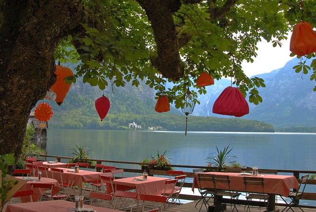
Photo: Hallstatt Cafe/Restaurant, early morning, Austria. I kind of wish we were hanging out there right now.

Hey, I read that “why I broke up with…” post on Gadling and never read the byline. Bad reader.
Heh. At least you read it. 🙂
I really enjoyed ‘six reasons I broke up with your blog’. It’s just brilliant, but just one question. Is the ‘white on a black background’ really such a horrible thing? I have met many people who say they are perfectly ok with it and a few that hate it? what’s the best alternative if you definitely don’t want the classic grey letters on a white screen? My blog is white on black, and I do it to make the pictures pop, but I don’t want it to prevent people from reading the blog.
Denise
It’s a readability thing. I’m old and my vision has always been crappy, white on black is physically difficult for me to read. A lot of photo blogs do this because it makes the photos look great, it totally does. But for me, readability goes WAY down when there’s white text on a dark background and I won’t bother to read because it gives me eyestrain.
http://www.google.com/search?btnG=1&pws=0&q=white+text+on+a+black+background
Thanks for that. I’ll just pick your brains for a second if you don’t mind. would white text on a dark grey background also be hard to read?
Try it. Seriously, try it. Best is dark text, light background.