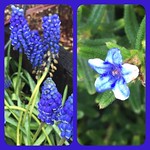
My first semester in art school (San Jose State, if you’re wondering), I had to take a color theory class. It was a big seminar thing taught by an artist named Tony May. I hated the class, the projects were tedious and I thought the Bauhaus artists to which my instructor was devoted were a bore. I rolled my eyes through the relative color exercises where we’d have to create studies that showed how a color appears completely different depending on what it’s surrounded by. (What color is that dress? Shut up, that’s what color it is.) And I gnashed my teeth while painting immaculate little grids of gray scales and the transition steps between complementary colors and, oh, any number of time consuming activities that did not feel creative in the least.
 |
 |
 |
 |
 |
 |
 |
The thing I did not realize at the time was that this class would lay the foundation for what sometimes feels like a cellular understanding of color and how it works. I felt — still feel — an enormous sense of satisfaction with the color in my house, the way I can lie in bed and see through from my pale lavender bedroom to my orange kitchen through my green living room, the way, the way the orange on the floor is the perfect match for that on the walls even though I didn’t have a sample with me when I picked out the paint. There are things I just, well, know about color now that I would not have known before that slog of a course, and Bauhaus painters don’t bore me anymore.
I don’t make much art by hand these days, but over a series of recent morning walks I gathered the spectrum of the rainbow. It pleased me to go out looking for yellow, or to try to figure out the shift between blue and indigo, and then, to stack all the photos together. Each day I’d head out and think, today, today is whatever that color was for the day. And I’d notice all the green, for example, and think about the blue that followed and how that was not what I needed today, or if only I had seen that yellow yesterday. (Actually, there was no shortage of yellow, actually, as the daffodils have been in full bloom here in Seattle.)
An innate sense of color is not, perhaps, a particularly useful attribute for a person who does not work in design in any capacity, but the pleasure it gave me to seek all those colors out and then, to stack them in sequence, was not unlike what I feel when the light is just right coming into my house and I can see that the reason the color works so well is that everything is the same value, the same saturation. I’m now sorry I ditched my Itten text, who knew I’d ever wish I had kept it? Who knew I’d think fondly of Albers — who’s work you can now get as a free app. At any rate, it feels good to notice all that color, to enjoy it, and thanks to that semester of fussy homework, to understand why it all works so well.
Also you should totally ROY-G-BIV your Instagram feed. I did and it was fun. I might do complements next.
Tony, you won’t remember me, but thanks.

I might give this a go! Thank you for the post! 🙂